
Embroidery That Looks Expensive: The Hidden Details That Separate “Clean” Stitching from Cheap Stitching
Embroidery can look premium and polished—or it can look puffy, uneven, and “off,” even if the same logo is used. The difference usually isn’t the shirt or hat… it’s the small production decisions most people never see. In this guide, we’ll break down the hidden details that make embroidery look expensive: digitizing choices, stitch direction, underlay, pull compensation, proper sizing, thread selection, and garment pairing—so your polos, hats, jackets, and uniforms come out crisp the first time.
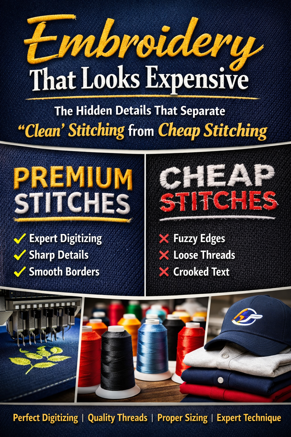
If you’ve ever compared two embroidered logos—same artwork, same placement, same garment—and wondered why one looks crisp and premium while the other looks thick, wobbly, or messy… you’re seeing the difference between average embroidery and professional embroidery.
Here’s the good news: expensive-looking embroidery isn’t magic, and it doesn’t require “luxury thread.” It’s the result of dozens of small decisions made before the needle ever hits the garment—things most customers never see, and many shops don’t explain.
At AccentTShirts.com, we embroider uniforms, hats, polos, jackets, and branded apparel for Las Vegas businesses, events, and teams. This article is your buyer’s guide to embroidery quality—so whether you’re ordering 12 polos or 1,200 hats, you know what separates clean stitching from cheap stitching.
Let’s break it down.
What “Expensive” Embroidery Actually Means
When people say embroidery looks “expensive,” they usually mean:
- Edges are sharp (not fuzzy or jagged)
- Text is readable (no blobs, no broken letters)
- Stitches look smooth and consistent
- The logo sits flat (no ripples, no puckering)
- The fill looks even (no gaps or “wormy” stitching)
- The design is properly sized and centered
- It holds up after washing without warping
That’s the standard. Now let’s talk about how it’s achieved.
1) Digitizing: The #1 Factor Most People Don’t See
A common misconception is that digitizing is “converting a logo into embroidery.” That’s like saying building a house is “converting wood into a home.”
Digitizing is programming. It controls stitch type, direction, sequence, density, underlay, compensation, tie-ins, tie-offs, and more.
What cheap digitizing looks like
- Outlines that wobble
- Fill areas that look choppy or inconsistent
- Text that becomes unreadable at normal sizes
- Puckering around edges
- Excess trimming and messy jump stitches
What premium digitizing looks like
- Clean satin borders with smooth curvature
- Fill areas that look uniform and intentional
- Text optimized specifically for embroidery (not “as-is” from the logo)
- Smart stitch order that reduces distortion
- Balanced density that lays flat and durable
Pro tip: If you’re ever told “it’ll stitch fine” without anyone asking about size, garment type, or placement… that’s a red flag. Great embroidery starts with questions.
2) Size Matters: Embroidery Has Real Physical Limits
Embroidery isn’t ink—it’s thread. Thread has thickness. Needles move fabric. That means some details simply can’t be stitched at tiny sizes without sacrificing clarity.
Common premium sizes (guideline)
- Left chest on polos/work shirts: often 3.25"–4.25" wide
- Hat front: often 2.0"–2.5" tall (varies by hat structure)
- Jacket back: can be much larger (but needs smart stitch strategy)
The problem with tiny text
Small text is the #1 reason embroidery looks “cheap.” Not because the shop is bad—but because the logo wasn’t adjusted for stitch reality.
If your logo has tiny taglines or thin strokes, the expensive-looking move is to:
- remove the tagline (or stitch it larger somewhere else)
- thicken strokes
- simplify small interior gaps
- increase overall size where possible
Premium embroidery is often a tailored embroidery version of your logo, not the exact same artwork you use on a website header.
3) Underlay: The Invisible Foundation That Makes It Look Clean
Underlay is stitching that goes down first, underneath the visible stitches. Think of it like a primer coat before paint.
Why underlay matters
- Stabilizes fabric
- Prevents sinking (especially on polos and fleece)
- Reduces puckering
- Helps satin borders stay crisp
- Makes fills look smoother and more even
Cheap embroidery often skimps on underlay to save time, which can lead to that “messy, unstable, uneven” look.
Premium embroidery uses the right underlay for the garment—not the same underlay for everything.
4) Stitch Direction: The Detail That Separates “Flat” from “Premium”
Stitch direction is one of those subtle things you can’t unsee once you know it.
Premium stitch direction does two things:
- It adds a natural “texture” to fills so the logo looks intentional.
- It prevents large areas from warping or pushing fabric.
Cheap digitizing often uses a single stitch direction across a big fill area. That can create:
- awkward shine (thread reflects light differently)
- visible “ridges”
- uneven pull
- distortion after wear/wash
Premium digitizing breaks up fills strategically and chooses stitch angles that support the design.
5) Density: More Stitches ≠ Better Embroidery
People assume higher stitch count equals higher quality. Not always.
Too low density looks like:
- gaps
- fabric showing through
- weak coverage
- “cheap” appearance
Too high density causes:
- stiffness (logo feels like cardboard)
- puckering
- thread breaks
- warping over time
- bad edges
Premium embroidery is balanced. The logo covers cleanly, lies flat, and doesn’t feel overly rigid.
6) Pull Compensation: The Fix for Warped Edges
When a needle punches fabric thousands of times, the fabric naturally “pulls.” Without compensation, circles become ovals, corners round off, and borders can look uneven.
Pull compensation is a digitizing adjustment that accounts for distortion so the final result lands where it should.
This is a big reason two shops can stitch the “same file” and get different results.
Premium embroidery anticipates pull. Cheap embroidery reacts to it (or ignores it).
7) Stabilizer Choice: The Backing You Never See (But Always Feel)
Backing is not one-size-fits-all.
The stabilizer choice should match:
- garment fabric (polo pique, fleece, twill, knit)
- placement (chest vs hat vs sleeve)
- design density and size
- whether the item stretches
Cheap embroidery often uses a default backing for everything. Premium embroidery chooses the right stabilizer to prevent puckering and keep edges crisp.
Especially on performance polos and stretchy fabrics, stabilizer selection is the difference between “pro” and “why does it look wavy?”
8) Thread Type + Color Matching: The Details That Elevate
Most embroidery uses quality polyester thread for durability and colorfastness. But the “expensive” part is often in:
- choosing thread colors that match brand colors closely
- choosing the right sheen level for the garment style
- knowing when to simplify color transitions for clarity
Brand colors: what’s realistic?
Thread isn’t Pantone-perfect across every lighting condition. But you can get extremely close when the shop is thoughtful about color selection.
If brand accuracy matters (corporate uniforms, franchise requirements), mention it early. Premium workflows treat color matching as part of the plan, not an afterthought.
9) Trim Strategy + Jump Stitch Management
Ever seen a logo with little random threads sticking out? That’s usually trimming/jump stitch handling.
Premium embroidery:
- sequences the design to reduce jumps
- places tie-ins/tie-offs cleanly
- trims strategically
- avoids unnecessary travel stitches
Cheap embroidery can look “hairy” or messy up close, especially on hats.
10) Placement and Centering: “Close Enough” Looks Cheap
Placement is one of the easiest ways to spot the difference between premium and rushed work.
Premium placement considers:
- garment size range (S–5X)
- placket and buttons on polos
- pocket location on work shirts
- seam and crown structure on hats
- women’s fit vs unisex fit
A left chest logo that’s too low or too far toward the armpit can make even great stitching look wrong.
If you want expensive-looking uniforms, placement isn’t optional—it’s part of the quality.
11) Hats: A Special Category (Where Cheap Embroidery Shows Fast)
Hat embroidery is its own world.
Why hats are harder:
- curved surface
- seams and crown structure
- thicker material
- limited stitch area
- higher visibility (it’s on someone’s head)
- Premium hat embroidery usually includes:
- proper cap backing and hooping
- digitizing built specifically for hats (not “converted” from a polo file)
- smart density and underlay so it doesn’t pucker
- handling the center seam correctly
The #1 hat embroidery mistake
Trying to stitch tiny text or thin details on the front of a structured cap. That’s how you end up with unreadable lettering.
12) 3D Puff: When It Looks Amazing vs When It Looks Like a Mistake
3D puff (foam embroidery) can look premium and bold—when the logo is designed for it.
Puff works best for:
- thicker, simple lettering
- bold shapes
- logos without tiny details
Puff looks bad when:
- the design is too detailed
- the letters are too thin
- there are too many small interior gaps
Premium shops will recommend puff only when it fits the design. Otherwise, it can come out uneven or “lumpy.”
What to Ask Your Embroidery Shop (Copy/Paste Checklist)
If you want embroidery that looks expensive, ask these:
- What size do you recommend for this placement?
- Will the text/tagline stitch clean at that size?
- Do you digitize differently for hats vs polos?
- What backing/stabilizer will you use for this garment?
- Can you match our brand colors closely (or recommend thread colors)?
- Will you provide a proof/mockup for placement approval?
- If we reorder later, can you keep the same specs consistent?
A quality shop won’t be annoyed by these questions—they’ll appreciate them.
Real-World Scenarios: Picking the “Premium” Approach Fast
Scenario A: Corporate polos for a trade show staff team
Premium move: left chest embroidery sized properly + clean satin border + stabilized polo + simple readable logo
Avoid: tiny logo with tagline that turns into mush
Scenario B: Hats for a construction or service company
Premium move: hat-specific digitizing + simplified front logo + correct cap hooping
Avoid: thin fonts + too much detail + ignoring the center seam
Scenario C: Jackets for managers or VIP staff
Premium move: slightly larger embroidery + clean thread colors + stabilizer matched to jacket material
Avoid: overly dense stitches that make the jacket pucker or stiffen
How to Make Embroidery Look Premium on a Budget
You don’t always have to spend more—you just have to spend smarter.
The best budget upgrades:
- Simplify the logo for embroidery (especially text)
- Choose the right garment (cheap polos can fight embroidery)
- Prioritize placement approval (avoid costly mistakes)
- Stitch slightly larger rather than forcing detail tiny
- Keep it to 1–3 thread colors if you want a clean uniform look
Most “cheap-looking” embroidery comes from forcing a detailed logo into a tiny space.
Consistency for Reorders: How to Keep Your Uniforms Matching
If you plan to reorder uniforms over time, here’s how to lock quality:
- Save the digitized file and notes
- Keep the same thread colors (record them)
- Stick to the same garment style/SKU
- Document logo size and placement
- Don’t switch methods (embroidery vs print) unless intentional
This is how you avoid “the new batch looks different.”
Final Takeaway: “Expensive” Embroidery Is a Process, Not a Price Tag
When embroidery looks cheap, it’s rarely because the shop used “bad thread.” It’s almost always because:
- the design wasn’t optimized for stitching
- the sizing was too small
- the digitizing wasn’t dialed in
- the garment/stabilizer pairing wasn’t right
- placement wasn’t treated as part of the craft
If you want embroidery that looks premium on hats, polos, jackets, and uniforms—especially for Las Vegas businesses and events—focus on the hidden details in this guide. That’s the difference between “good enough” and “wow, that looks legit.”